Last week I was honored to participate again in the Open House at Kleppinger Design Group in Merrifield, VA. Enjoy this montage of work by other Northern Virginia designers.
Wednesday, December 7, 2011
Monday, November 14, 2011
The Harvest Touch

Here's a quick little low-cost update I gave to my foyer. On the foyer wall is a wreath of cherubs, made to look like it is carved of wood. I wanted to add a bit of something to reflect the season and came up with using a little berry wreath in Autumn colors inside the larger wreath. I had just hemmed a burlap table skirt and instead of throwing away the piece I cut off, I made a ribbon of it. Then I used the burlap ribbon to hang the small wreath from the larger one. So simple, so pretty.

Wednesday, November 2, 2011
Movin' & Shakin' Things Up

Oh, how I wish I had taken a before picture!
One of my favorite clients is on her 3rd house, or rather her third house with me! Now with her boys all grown, she and her husband have moved to a lakeside golf community and loving it.
The house was a resale. She liked the layout and even kept some of the paint colors. The house also came with a lot of window treatments that were very nice, but not in her taste. So yesterday we installed new draperies in the living room. What a difference. First of all, the original drapes were a very dark, red faux silk.
 My client chose a fabric printed with a stylized suzani design, very bold and cheerful. So cheerful, in fact, that when her husband came in and saw the gorgeous treatments at the windows he said, "Wow! That looks SO much better. It looked like a funeral parlor in here before."
Notice the serendipity of the printed pillow on the sofa.
 I call it the Little Sister print of the drapes. The funny thing is, that pillow matched the drapes in the living room of house #2! The homeowner likes a particular color palette and sticks to her guns! That is one way to keep continuity in your home, whether you move or not.
We kept the hardware from before. The shutters were installed right after my client moved in. The fabric is from Kravet and the trim from Stout Textiles.
Monday, October 31, 2011
Happy Halloween!

My favorite Halloween picture.
I'd go out and buy a bushel of pumpkins if I owned that staircase!
Thursday, October 20, 2011
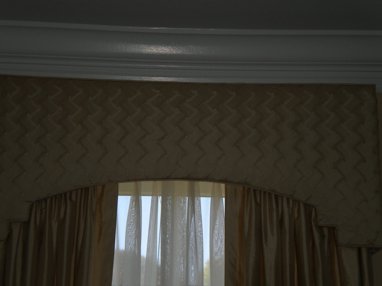
In Living (Room) Color


Get ready. Things are about to get a little more colorful. After a few years of no-color or mostly gray rooms, we are seeing a trend of lots more color.
This living room is a good example of bringing color into what started as a very neutral room. It is actually a good idea to keep you larger pieces of furniture and maybe your window treatments neutral so you can add color - and change it up - with smaller less expensive things.
The wall color in this room was a peachy beige - nice and warm but not so much personality that it is overpowering. The sofa is a classic style in a neutral gold. We added some pizazz with the red velvet pillows that are the same velvet as the gorgeous chairs.
The dining room chairs were upholstered in a muted geometric print.

Since the dining room and living room are across the foyer from each other, it was better if the window treatments were all the same. We kept those in a subtle tone since there were so many windows in the two rooms. But we added some texture by having the same silk of the draperies pleated into a basketweave pattern for the cornices.
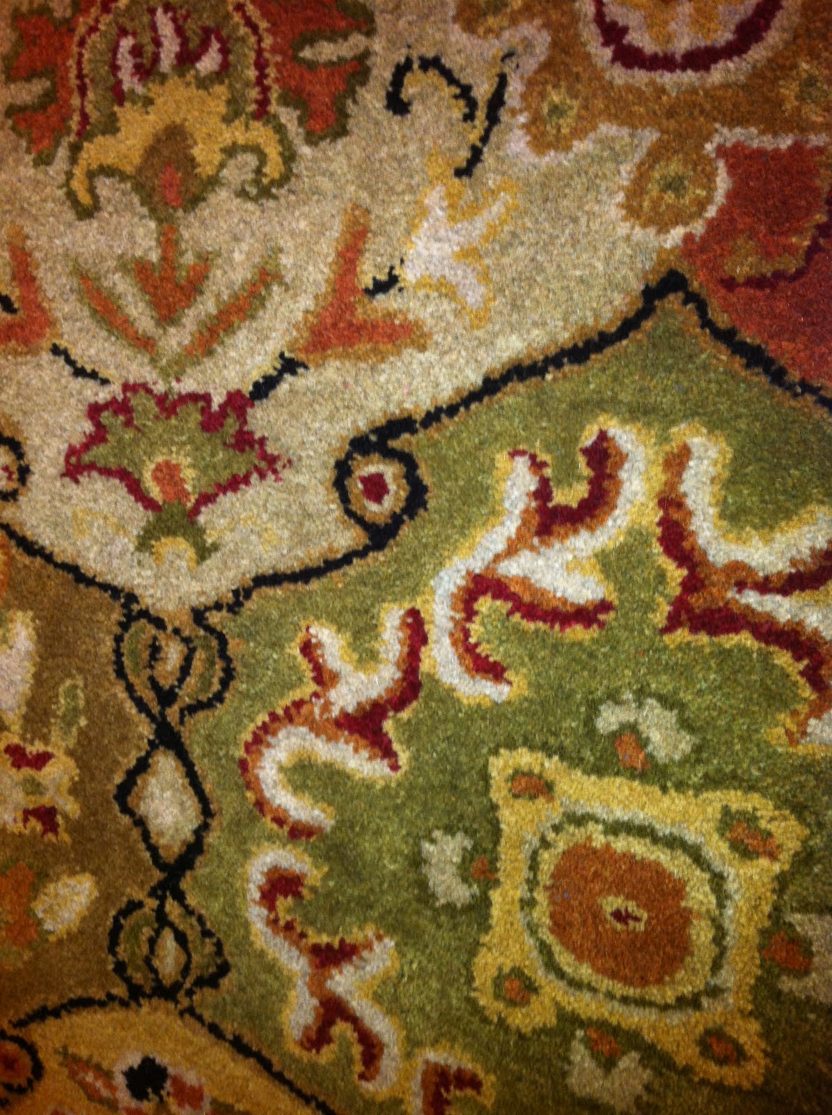
My client has a lot of beautiful, colorful objects on her display shelf. And she plans to add a colorful rug when she finds the perfect one.
One other way to make a room interesting besides adding a lot of color is to vary the textures and shapes. For texture we had the pleated vs. plain silk, the red velvet, the matelasse and nailheads on the sofa, and the shiny brass lamps. The glossy marble foyer was also added midway through the project. But the most texture of all was in the wonderful print over the sofa.
 Look at the variety of shapes we used: most noticeable are the backs of the red chairs, the arms of the sofa and the bottom of the cornices which not only echo the shape of some arch doorways in the home, but the stairstep detail is a reference to the Asian display case.
Sofa and red chairs by Duralee Fine Furniture. Fabrics on sofa and chairs by Duralee. Dining room chair fabric by Chelsea Frank. Drapery fabrics by Libas Ltd. Pillow trim by Kasmir.
Tuesday, September 27, 2011
One More Reason to Go Shopping

Decorate your home. It gives the illusion that your life is more interesting than it really is.
-Charles M. Schultz

Photo from last year's Homearama. Designer unknown.
Thursday, September 22, 2011
Find Your Center

No, this isn't a post about finding your spiritual center. A recent question on Facebook was about centering artwork on a wall in relation to furniture. Although I chimed in, I agreed with everyone else who chimed in that you should center large artwork over the furniture - in this case a sofa - and not on the large wall in general.

I happened to run into this on a project we recently completed in Virginia. The large lovely painting was centered on the wall when I got there. It had been hung in relation to the old sofa and draperies. We had installed a smaller sofa and new window treatments, but waited to move the picture until the end. With two large brass floor lamps from Restoration Hardware providing the symmetry, we moved everything down, or to the right a little. We could have moved it all further, but when we did, a very unsightly outlet showed to the left of the sofa. Upon entering the room that's all my eyes saw! Ugh! So rather than strictly following the exact measurements, we fudged it a little and it looks so much better. Sometimes it is better to make your rules up as you go.

I will post more pictures of this project later. There are some beautiful silk window treatments and red velvet chairs that you have got to see. We are also about to change the rug, the coffee table and add a settee.
Monday, September 12, 2011
Design Aphrodisiac

...SOMETHING TO PUT YOU IN THE MOOD...to decorate!
I run across design aphrodisiacs all the time. I suppose it is one of the hazards of my job. Or maybe I am just easily sidetracked. Whatever. I just love a good design idea, a pretty little something, or crazy creativity.
Here's something to jumpstart your designer brain. I happen to own a lot of books, the kind you like to curl up in a chair with, by Mary Carol Garrity.

She is the owner of 3 stores in Kansas, the most famous of which is Nell Hill's. Her style is a mix of classic and vintage looks. Mary Carol is a master of display.

Every time I thumb through one of her books, I want to rearrange a tabletop or create some kind of floral arrangement. She is the queen of the tableau or tabletop vignette. Whenever I am creating a little scene, I say that I am vignetting. This is a great way to use some of those smaller decorative items you might have. Another thing you will notice from the Nell Hill library is her love and use of books in decorating.
There is also a to-the-trade collection of accessories that I have used extensively for clients and gifts. You can see these items on her website, but please know that we sell them, too. In fact, if you have ever been to my home, you will recognize more than a few of these items.

As you peruse the website or one of the books, be on the lookout for the following:
Mary Carol's dark navy blue dining room, the video of the Christmas tour, beautiful table settings, multiple uses and holders for candles, great entertaining ideas, bouquets of branches and foliage, and so much more.
She is a kindred spirit. Did I hear someone shout "Field Trip!" ?
Wednesday, September 7, 2011
Laduree

Well it had to happen sooner or later. My beloved Parisian tearoom has opened new doors in one of my other favorite cities, New York.
I was at the Business of Design '11 conference in NYC last week and took a long walk up Madison Ave. to see the new Laduree and buy some of their fabulous macaroons. Lo and behold - and I SHOULD have expected it - there was a line out the door, as is often the case with cool places in NYC or cool places anywhere. As I was to meet a friend shortly for cocktails, I couldn't wait. Boo hoo, I didn't even get to peek inside to see what the tearoom was like.

Which was probably good as I would not have been able to handle the disappointment. There is no tearoom, no comfortable place to put up one's feet (as if you would ever put your feet up! on what?!)You can only buy your goodies retail, like a bakery. But Laduree is currently looking for a space for a tearoom. I learned all this from another dear friend who DID wait in line, and DID buy me a box of macaroons. Now that is a good friend indeed! Check out the beautiful box I was able to add to my collection. And I would like to confess that the caramel flavor was close to a spiritual experience.

For more information about Laduree, go here
Monday, August 22, 2011
Lighting - with a Twist

Study this photo for a second. I took this picture at a restaurant in Greenpoint, Brooklyn. Such an interesting, inspired kind of lighting. I wouldn't call it a lighting fixture. It's more of a design element than a fixture. What I think they did was run plain light bulb sockets along a ledge and cover them with random lampshades. There were no lamps up there - the shades sat right on the ledge. So much fun! My hat is off to the creative person who thought of it.
Thursday, August 4, 2011
The Greenbrier - A Visual Feast
I have been doing a lot of travelling this year. Whenever I can I love to stay in big historic hotels. Back in February I finally made it to the Greenbrier Hotel in White Sulphur Springs, WV. It is over the top beautiful.
The hotel interiors were originally designed by Dorothy Draper. In 1923, Draper established the first interior design company in the U.S. She invented a style called "Modern Baroque", which is particularly suited to large public spaces and modern architecture.
Draper used vibrant colors in never before seen combinations such as pink and aubergine, with a bit of chartreuse and a touch of turqoise. Her dictum, which I love because of it refusal to enforce any design rules, was "if it looks right, it is right".
When my friend found out I was visiting The Greenbrier she sent me this message: "Gotta love big flowers!" to which I would add: "and big stripes and big chandeliers!" Of course, I love them all.
Fun & Easy Valance

I saw this window treatment in a model home. Such a cute idea! Loved that it was a departure from traditional but wasn't too far out there. Also loved the way three fabrics were used.
But there is a glaring mistake on this treatment. Why did they use white lining on the valance portion?? It really takes away from the effect. My eye went straight to that white lining. It would have been so easy to self-line this or line in an inexpensive cotton in a coordinating color. Maybe it was an oversight - been there! - or maybe they only had so much of the solid fabric - been there, too! - but if that was the case, I repeat: use some inexpensive colored lining! Or add trim along those seesaw edges and you wouldn't see the lining. How cute would some pom poms be along the bottom edge? Or to fancy it up, some tassel fringe?

Tuesday, July 26, 2011
Photo study

This picture comes from my Idea file, which is code for "I stole it off the internet". So I am sorry I cannot give credit to the designer or photographer. (I have a sneaking suspicion it's Carolyne Roehm - must investigate!) It looks like a photo from a magazine or book, though.
If you keep photos of ideas you love, sometimes it is a great exercise to study the photograph. You can more clearly define what you love about the space and you also start to recognize some design concepts.
I'm positive I kept this particular photo because of the brown and cream color scheme. It's so warm and restful. As a designer, one of the constant requests I get when decorating a master bedroom is for it not to be too feminine and this room certainly fills the bill. Sticking to just 2 colors with high contrast is also appealing.
The design concept you see is that of symmetry. Notice all the pairs of things! Symmetry gives you a feeling of balance, that things are on solid ground. You are able to relax when you feel your surroundings are organized. Notice too, the simplicity of the items in the room. If it weren't for the carving on the bed or the frou-frou mirrors, everything would seem rather plain.
Monday, July 25, 2011
Lighting

Why do we live so long with light fixtures (particularly ceiling mounted ones) that are outdated or are incongruent with the rest of the room design? I know I am as guilty as anyone.
Trends in lighting change just like everything else although some classic styles, like a crystal chandelier are always right in the right space.
While at the Atlanta gift show I spied lots of beautiful lighting styles, but I am including 2 new ones here so you won't go into decorating overload.

This lantern style is much bigger than it looks in the picture. If you had a large kitchen island, 2 or 3 of these would look magnificent!

What would you call this style? Lantern? Chandelier? It was very rustic, like pieces from an old oak barrel which is why my first thought was - use this in a wine cellar! It would also be great as a foyer chandelier in a casual home or anywhere you have a sort of lodge look.
Both lighting fixtures by Currey & Co.
Top photo at Valerianne, Vienna, VA
Friday, July 22, 2011
Office Gets New Life
This project is in my own home. When we first moved into our home 17 years ago, the small front room was a TV room, mostly because I didn't want to hear the noise from a TV all the time, especially when I was in the kitchen. We had 3 small children at the time.

When the basement was finished, we moved the TV down there, and it became the teenager hangout. The old room became an office/study. Not MY office mind you, but it did have a pretty desk and an old hutch we used to store books. I have WAYYYYY too many books. I mostly paid bills in there or it was a quiet place to take you laptop.
When I took the before picture, I left everything as messy as it was, because in reality, the room had become a dumping zone. The desk was always covered. Although I still loved the wallpaper, it's heyday had come and gone. Took it all down and painted it a warm neutral color. (If you want to know the exact Benjamin Moore color, leave a comment and I will go look it up.)

The drapes are the real focal point of the room. They are a very rough, natural silk, perhaps matka. I trimmed the hem with a band of a darker, slightly finer silk. At the top, pleated edge, I inserted a small cord covered in a red combed cotton. The hardware is to die for. It is from Paris, TX Hardware.


I moved in two red leather chairs I had. Also moved in a faux mantle I had in a bedroom and placed a flat screen TV on it - you can barely see that. Really, this was what I call a "placeholder" to see if 1. We really sit in there, and 2. If a TV works on that wall. If it all worked out, which it does, I am now on the hunt for a large wall to wall unit to hold the TV and give me more storage. For books.


Wednesday, July 20, 2011
The Project Room

Here is a very interesting project I did a few months ago. It is called The Project Room. My client converted an empty bedroom into a space for homework, gift wrapping and other "projects". This was your typical bedroom, with a side window and a back window. She used cabinets on three walls that allowed for desk space and a window seat. In the middle of the room she had a custom made island that was great for storage. She has all of her gift wrap organized in it.

The window treatments consisted of Stagecoach Valances, which look a bit like stationary Roman shades. Under the valances, she put honeycomb pleated shades with the top/down-bottom/up option.
You can see that we had a custom cushion made for the window seat and dressed it up with some pillows in coordinating fabrics. All fabrics by Duralee.

What empty space in you home could you make more useful?


Tuesday, July 19, 2011
Atlanta Gift Show
I have never been to the Atlanta Gift Show before. Here are some superlatives: Gigantic, Crazy, Overwhelming, Colorful, Inspiring.
I should have taken more pictures, particularly from the escalator in Building 3 to give you a rough idea, but here are a few things(a very few things) that caught my eye.
Gotta love big flowers.
A floor that I assume is removeable and looked like an interesting do it yourself project. I saw several variations of this, and had seen it before at High Point Market, but I still find it fascinating and beautifully rustic and elegant at the same time. I think this was at Barreveld.
Also at Barreveld, this vignette with the tall iron stags balancing on iron balls. Had to have them so I bought them. Everyone who has seen this picture wants to know what I am going to do with them. Patience, dear friend, patience. (Perhaps I should say, Deer Friend - hee hee.)

Colorful rug at Surya. Might use it in a project.

This was a wonderful bar/buffet with slide out trays and room for wine bottles. I'm not positive, but I think it was at Guild Master.

Last but not least, a little cottage chic. This was a great piece for storage and came in lots of colors. I'm thinking about using it in a child's room.
I should have taken more pictures, particularly from the escalator in Building 3 to give you a rough idea, but here are a few things(a very few things) that caught my eye.

Gotta love big flowers.

A floor that I assume is removeable and looked like an interesting do it yourself project. I saw several variations of this, and had seen it before at High Point Market, but I still find it fascinating and beautifully rustic and elegant at the same time. I think this was at Barreveld.

Also at Barreveld, this vignette with the tall iron stags balancing on iron balls. Had to have them so I bought them. Everyone who has seen this picture wants to know what I am going to do with them. Patience, dear friend, patience. (Perhaps I should say, Deer Friend - hee hee.)
Colorful rug at Surya. Might use it in a project.

This was a wonderful bar/buffet with slide out trays and room for wine bottles. I'm not positive, but I think it was at Guild Master.

Last but not least, a little cottage chic. This was a great piece for storage and came in lots of colors. I'm thinking about using it in a child's room.
Thursday, July 7, 2011
Yummy Green Velvet

This is the name my client gave it. The Yummy Green Velvet Chair. She found it in an antique store and loved it's shape, but didn't love the fabric or the wierd sound it made when she sat in it. I quickly decided it must be stuffed with horse hair, a fact my upholsterer later confirmed. He redid the "stuffing" and upholstered it this beautiful green velvet from Duralee.
The chair sits like a piece of sculpture on the far side of a long master bedroom. That was our intent as you can see by the extra long windows, that this room was all about drawing you to the outdoors. My client is a fabulous gardner so it gives her great pleasure to curl up in that chair with a book and gaze out at the lovely fruits of her labor.
Subscribe to:
Posts (Atom)