Showing posts with label Inspiration. Show all posts

Sunday, February 3, 2019

Gray is not the Answer

I'm going to make a politically charged statement:

You don't have to paint your walls gray!

I know, I know.  It's everywhere.  JoJo paints a lot of her walls gray on her show, as does Christina.  It's everywhere, and gray's demise has been predicted for months.  And yet.......it's still here.

My friend recently listed her house for sale and a stager was brought in who told her to not only paint her walls gray but her beautiful cherry kitchen cabinets as well.  She refused.  Seriously, do people think that gray is the only neutral color?

I get it.  The realtors are trying to present the most neutral home possible, but is it really true that people can't visualize their way past a paint color?

And don't get me wrong; I love gray.  When I was 10 years old it was my favorite color.  I have gray in two of my guest rooms.  One is gray and yellow (mostly yellow), and one is gray and pink.
Duvet cover by Callisto Home
All gray bedding from County Road. Pink pillows with glass bead trim designed by Antonia Korby Design.

And that's my point.  In a world where you can have any color you want, gray is not the answer.  I have decorated more gray on gray rooms than you would believe, but that is because it came at the request of the homeowner. "How about if we add a little yellow in the draperies, because there is some yellow in the painting in this family room?"  "No", was the answer, "I think I'd like some some white draperies with gray embroidery on them." The dining room was already gray and white, as were the living room and kitchen.  That kind of decorating is highly photograph-able, and also has a model home quality, but can get a little boring.  And drab. And lacking much personaltiy, or CHARACTER, as they say on TV.
Roller shades by LuXout

And I get it that gray goes with everything.  Everything. Every color looks good with the right gray.  So please, feel free to use a LOT of color.  Because that is the trend that I'm seeing now. 
I know that I have shown a lot of gray/yellow combinations but I also love gray with red and gray with bright green.

I agree that a technicolor house would be a difficult house to sell.  But if you are going for neutral, there are so many other "colors" to choose from.

In  the end, my friend sold her home for more than her asking price. The buyers said that when they walked through the house for the first time, it just "felt like home"!

Monday, August 13, 2018

Blackout Bedroom

Occasionally, when working with a client on one project, we will spot a fabric for another project.
This gorgeous grey fabric with a geometric stripe woven in caught our eye and knew it would be perfect for the master bedroom. The husband wanted "blackout curtains" so he could sleep late and not be bothered by the sun peeping in.
But there were so many windows in this bedroom plus sitting room and the lovely fabric was a bit expensive for long drapery panels everywhere.
We hit on this idea of traversing drapes on the back windows and Roman shades on the side windows and in the sitting room. (Actually, it was the mother-in-law who thought of this!)
The custom made pillows in shades of grey, cream and gold were the finishing touch!

I love the mix of masculine and feminine. But mostly I love the fact that the husband thinks he's going to sleep in!  These clients have a newborn baby!! 

Drapery fabric by Unique Fine Fabrics.
Large grey pillow fabric by RM Coco.
Trim by Trend
Geometric pillow fabric by Fabricut
Velvet floral pillow fabric by Trend

Monday, July 16, 2018

One fabric, Two rooms

If you want to unify two spaces, especially if they are side by side, try using one fabric for both, like we did here: 
fabric by Kasmir

Here is the Dining Room, before:

And after:

And a different view: 


And here is the Living Room before:

And after:

Another view:


And finally, a close up of one of the drapery panels and the hardware:


Thursday, July 12, 2018

Get an "A" in Geometry

Geometry was the only kind of math I did well in.  I've asked other designers about this and many agreed that they were good in Geometry, too.  Not one said they got an "A" in Calculus!  We tend to think in space and shapes.
The geometric embroidery on this fabric was really appealing.  In a room of solid fabrics, it gave us some pattern to work with.

The family room was in really good shape, decoratively speaking.  It just needed the finishing touch of window treatments so we chose to do soft stationary drapery panels with a French pleat header. Some people call it a Euro pleat.  And those corner windows - a matching pair! thank you Mr. Architect! - were going to be a challenge.

My installers did an incredible job, as usual.  They make an installation like this look easy.


I give this project an A+  !!!


Fabric by Kasmir
Drapery hardware by Graber 
Blinds were customer's own


Wednesday, February 7, 2018

Dressing the Bed


Dressing 6 different beds last week (for more than one house) 

has us wondering how you like to dress your bed?   

Cozy? 

Comfy?      Glam?     Elegant? 

Grandma's vintage quilt?     

What can we offer that will make you rest better and feel equipped to energize through your day?  


In upcoming posts we will be discussing trends we are seeing.  Like a return to luxurious bedding, but with less - a lot less - pillows (We hear you gentlemen cheering!)

And what has happened to the bedskirt?
Stay tuned........


Wednesday, November 1, 2017

Time to get the cobwebs down?

  So maybe you didn't literally use spiderwebs as your    Halloween valance like we did,  

but is it time to TREAT yourself by dressing your windows?  

Sunday, October 29, 2017

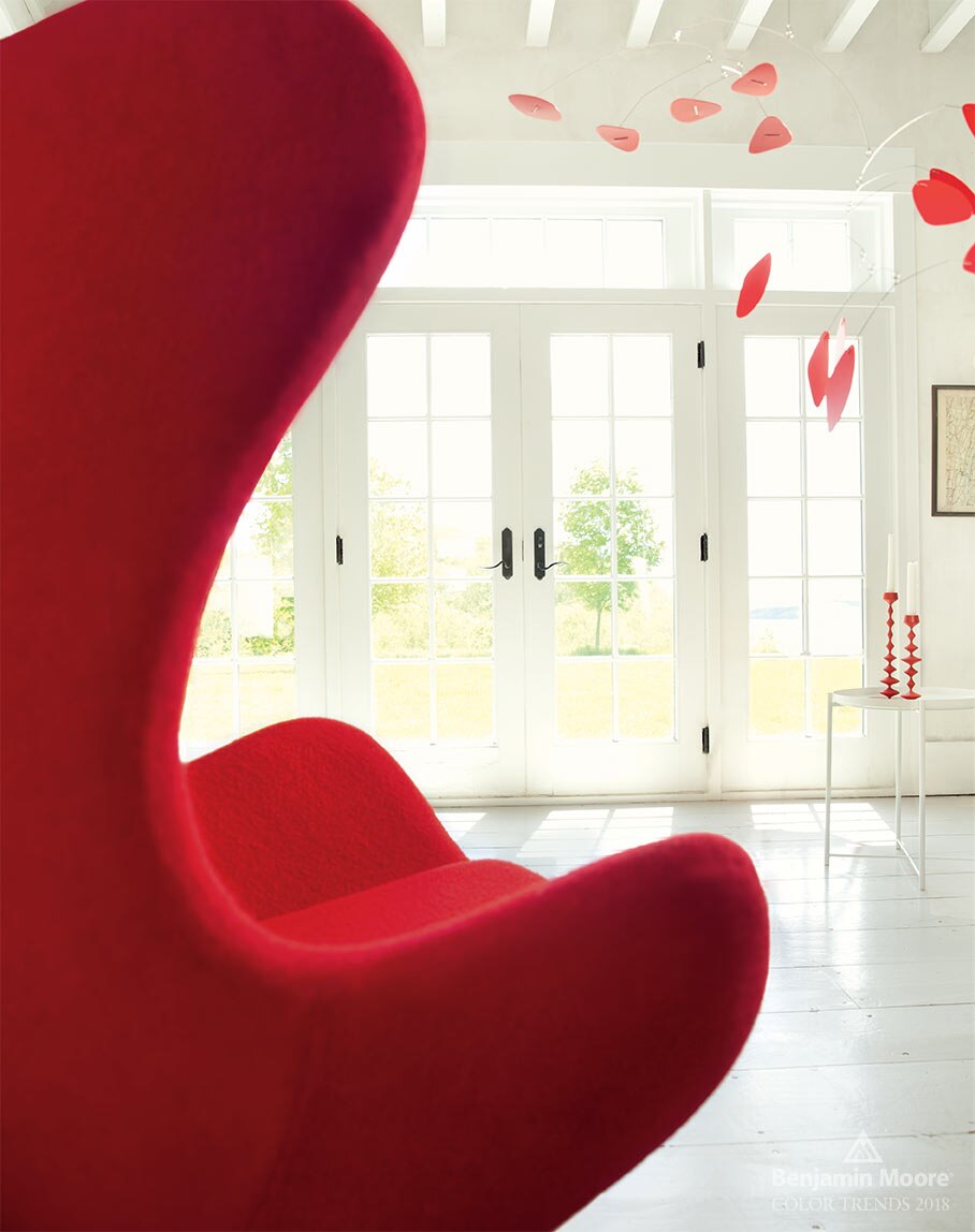
Seeing Red


                                   Rojo 


                                                                 Rouge

We are seeing RED everywhere especially now that Benjamin Moore has announced its color of the year 2018 as 

                          C A L I E N T E 
                              AF - 290


Are you ready for a color consult? 

-image courtesy of Benjamin Moore

Monday, September 25, 2017

O.K. You can spot it-- I mean Stop it, now

Stop seeing spots, you say?  We can't help ourselves . . .


J. Crew 

CPK Floral Designs 


CPK Floral Designs
Cindy provided gorgeous floral centerpieces for a recent Wine-Tasting Event at Eddie Merlot's in One Loudoun.   Spot the ribbon...
 J. Crew calf hair boot 


             Duralee spotted-yumminess ready for us to fashion into something for you. . .


This pillow!   


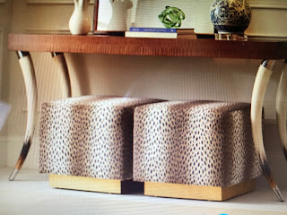
These ottomans?   


Okay,  we really will try to stop now. . .    

Tuesday, September 12, 2017

More Zebras?

We just can't get enough of animal prints, 
 as you know from our recent post.   


So how about this find in the retail jungle?   


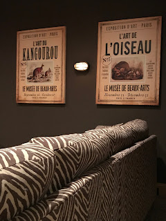
A comfortable and gorgeous zebra sofa for the movie theater room and matching animal prints for the walls. . .   
located in the same consignment shop at the same time in one of our favorite local haunts, but in two separate rooms.  We were so thrilled at the spoils of our "hunt"! 

Detail from zebra sectional sofa


Leopards and Giraffes and Zebras, oh, my?


We are seeing so many wonderful animal
prints in the design AND the apparel
world this season. . . it makes us 
want to go on a  photographic safari! 


courtesy of Nat Geo 


Caracole in Purr-fect


Or perhaps a daydream in this chair?  


Wednesday, August 30, 2017

Driftwood Plantation Shutters


Our client sought a clean look for controlling light in her reading nook.  We warmed the space by suggesting plantation shutters in a Driftwood finish.  The effect is not only inviting, but thoroughly authentic with lovely flaws.  She loves the perfectly imperfect result;  we do as well.  


Shutter detail

Monday, July 24, 2017

Connecticut Blue

If you think choosing a fabric for a project is difficult, try finding a matching solid for lining and facing.
For our upcoming Greenwich, CT project we have two window treatments. Both designs include a colored facing for part of the treatment.  The fabric above, from Charlotte Moss, was easy.  The client wanted something silky and this faux silk in a rich gold color from Maxwell Fabrics was perfect.

And then we went in search of blue.

You may remember this powder room, also located in Connecticut, that we showed a while back:
The Dana Gibson wallpaper had the most delicious, vibrant shade of blue that turned out to be a challenge to match for banding on a white Roman shade we were making for the window.  We ended up using a Dana Gibson trim, because there was no solid blue to be found!

Now we call this particular shade Connecticut Blue, because it is the exact same blue as before.

We are not ones to give up easily!
We found a beautiful cotton sateen that will work perfectly!
This one from RM CoCo.
Want to use Connecticut Blue in your next design? Bring it!

Blue and white fabric from Bailey and Griffin, available through Duralee.


Wednesday, July 5, 2017

Play Outside!!


I'm a summer-time girl for sure.  I'd stay outside all day if I could, but since most of my work is in the INTERIOR of a home, I do spend most of my work day inside.
While I have hundreds of ideas for outdoor living, here are lots of ideas from other industry experts.  Thanks to MakeSpace for featuring me in their recent article.
 Here's the link:

 https://makespace.com/blog/posts/best-outdoor-decor-ideas/

And since summer is the biggest season of the year for moving, check out MakeSpace's blog for other ideas for storage, moving and organizing.

Thursday, February 23, 2017

Peacock

There is an incredible swatch floating around the studio with peacocks on it.  It has one of the largest pattern repeats I have ever seen (40" vertical, and 54" horizontal!!)
That's the one from the RM Coco website.
Here's the picture of the swatch in the studio:
So you see, you get two peacocks for the price of one!!
(Wouldn't this be amazing upholstered to the back of a chair!)

Gold!

Gold!!
From the sublime to the ridiculous!
 

Monday, February 20, 2017

Tony Duquette Wisdom

From a 3-day lecture series given by Tony Duquette at UCLA in the early 1970's


Thursday, February 16, 2017

Designer Luncheon

What a great day yesterday! I attended an event for designers at The Sweetwood Collection and Valerianne, where we had lunch and caught up with friends. 


This is a beautiful spot for shopping.  The girls, Stephanie and Denise, from The Sweetwood Collection, are the ones to see if you are looking for unique finds, accessories, art and repurposed antiques.


Aimee, from Valerianne, carries gorgeous high-end bedding and other textiles. 


When I got home, I removed the bow from my little giveaway, and it landed right on a paint swatch on my desk.  It looked so pretty there.  It made me smile. Sort of life imitating art.


Then I noticed that it looked good with a citrine stone that my son had given me for Christmas and told me to keep on the corner of my desk to attract prosperity!
 Valerianne and The Sweetwood Collection
295 Sunset Park Dr.  Herndon, VA 20170
703-437-3500