Showing posts with label Color. Show all posts

Saturday, February 9, 2019

Color is the Question

Last week I wrote a post about the overuse of the color gray.  If gray is not the answer, then I suppose color is the question.  The most common question I get regarding color is what color to paint the walls. The answer to that question is so dependent on the room you are considering and what is going on in the rest of the house.  Today I'd like to give you ideas of ways to add color if you already have a neutral backdrop.  Remember, the wall color is NOT the color scheme.  It can be part of a color scheme or it can be a compliment to the rest of the colors in the room. Here are a handful of ideas:
Colorful fabric is an obvious choice, even muted color.  

More colorful fabric, vibrant this time.  And colorful trim.

You may remember this colorful wallcovering from Dana Gibson with her matching trim on a white Roman shade.

Fresh flowers brighten any spot.

Colorful walls, tablecloth, artwork and draperies.  Notice how the adjacent wall space on the far left is another shade of blue!

This master bedrrom in shades of green and violet is still restful and inviting.

This trim from Brimar is able to withstand the elements, so your outdoor areas can be colorful, too!

The MOST colorful drapery hardware from Duralee.

Gorgeous fabrics and wallcoverings from Kim Parker.

Floral fabrics are everywhere! This one from Kravet Couture.

My all-time favorite fabric from Osborne and Little.

Pillows from Jaipur.

Pillow from Surya, when you want SOME color, but maybe not LOTS of color.

Colorful furniture, rugs and pillows in the EJ Victor showroom at High Point.


Sunday, February 3, 2019

Gray is not the Answer

I'm going to make a politically charged statement:

You don't have to paint your walls gray!

I know, I know.  It's everywhere.  JoJo paints a lot of her walls gray on her show, as does Christina.  It's everywhere, and gray's demise has been predicted for months.  And yet.......it's still here.

My friend recently listed her house for sale and a stager was brought in who told her to not only paint her walls gray but her beautiful cherry kitchen cabinets as well.  She refused.  Seriously, do people think that gray is the only neutral color?

I get it.  The realtors are trying to present the most neutral home possible, but is it really true that people can't visualize their way past a paint color?

And don't get me wrong; I love gray.  When I was 10 years old it was my favorite color.  I have gray in two of my guest rooms.  One is gray and yellow (mostly yellow), and one is gray and pink.
Duvet cover by Callisto Home
All gray bedding from County Road. Pink pillows with glass bead trim designed by Antonia Korby Design.

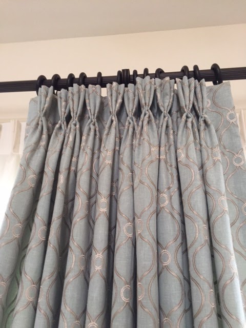
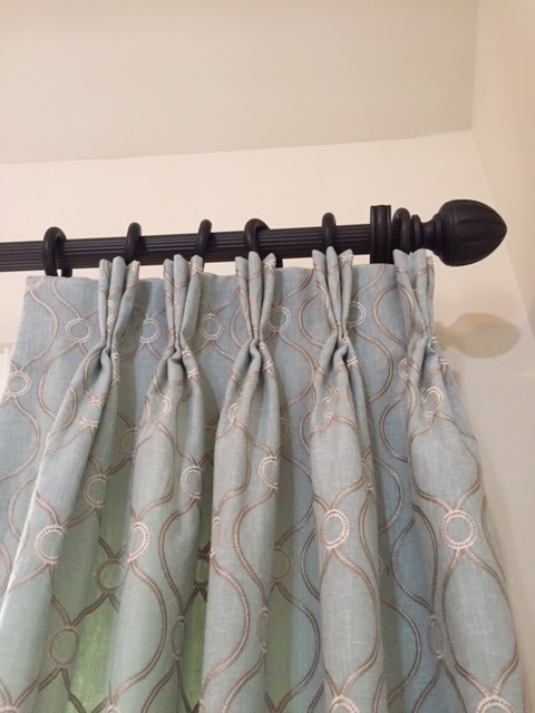
And that's my point.  In a world where you can have any color you want, gray is not the answer.  I have decorated more gray on gray rooms than you would believe, but that is because it came at the request of the homeowner. "How about if we add a little yellow in the draperies, because there is some yellow in the painting in this family room?"  "No", was the answer, "I think I'd like some some white draperies with gray embroidery on them." The dining room was already gray and white, as were the living room and kitchen.  That kind of decorating is highly photograph-able, and also has a model home quality, but can get a little boring.  And drab. And lacking much personaltiy, or CHARACTER, as they say on TV.
Roller shades by LuXout

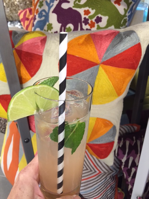
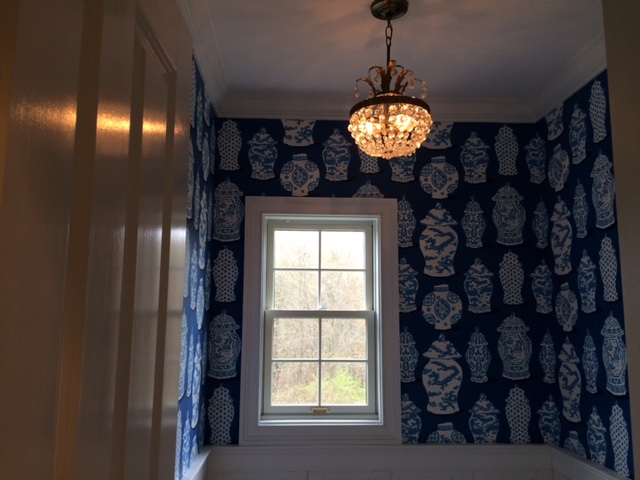
And I get it that gray goes with everything.  Everything. Every color looks good with the right gray.  So please, feel free to use a LOT of color.  Because that is the trend that I'm seeing now. 
I know that I have shown a lot of gray/yellow combinations but I also love gray with red and gray with bright green.

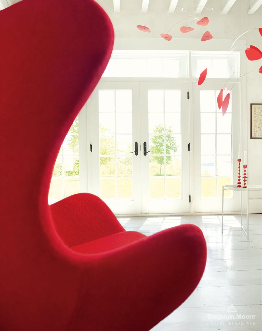
I agree that a technicolor house would be a difficult house to sell.  But if you are going for neutral, there are so many other "colors" to choose from.

In  the end, my friend sold her home for more than her asking price. The buyers said that when they walked through the house for the first time, it just "felt like home"!

Wednesday, August 22, 2018

Not Your Mother's Roller Shades

Growing up, my mom made all the window treatments in our home.  Well, I would bet my grandmother made the pinch pleated draperies, but my mother made everything else. 
When she learned how to make a roller shade, you better believe suddenly every window in our house had one!
For years, the roller shade with the scalloped hem was everywhere and they were usually made of cheap fabric, or worse, plastic!!  And they were always white.  Then the style fell out of favor and was replaced by mini blinds, then honeycomb pleated shades, wood blinds and plantation shutters.
We are about to install this pattern in a bedroom.  Stay tuned!

We recently found the next generation of roller blinds from LuXout Shades.  The fabrics are sourced from all over the world. There are solids to go with every decor and prints that can become the focal point of a room. And these shades are Made in America, in Virginia, in fact.
Take a walk in the woods without leaving the comfort of home.

Unlike the shades my mother made, the roller at the top can be hidden with a headbox.  The hems can be plain or scalloped and bedazzled with an assortment of trims.  

Our customers are loving this product. Depending on the style and options, the roller shade can fit any decor from traditional to eclectic to contemporary.
Imagine this in a beach house.  Or in the beach house you are dreaming about.

Monday, April 2, 2018

Simplicity

Simple objects in pretty colors always look appealing.
My Genius Assistant is going to love this photo.  She loves pencils!  I'm more of a gel pen girl myself.
What would you rather write with?  I'm sure there is a personality test in there somewhere!

Wednesday, February 14, 2018

A Fabric Valentine just for you. . .


Duralee Crypton Woven Jacquard
in Poppy Red


Vern Yip Trend Collection 

Kate Spade New York Trim

in 

Triple Dot Maraschino! 


Vervain Zenato from the Phoenician collection 
comes in 14 colors.   See the heart pattern?  


Tuesday, December 26, 2017

All that glitters. . .


vervain.com


How easily we are distracted by baubles, sequins, 
and shine, especially at this 

wonderful,
sparkly time of year!


Sophisticated gold and cherry tones have us swooning and looking for more places to decorate.  Wouldn't this make a lovely holiday tablecloth?     
Luzzano in Carnelian by Vervain

Sunday, October 29, 2017

Seeing Red


                                   Rojo 


                                                                 Rouge

We are seeing RED everywhere especially now that Benjamin Moore has announced its color of the year 2018 as 

                          C A L I E N T E 
                              AF - 290


Are you ready for a color consult? 

-image courtesy of Benjamin Moore

Wednesday, July 26, 2017

Color Makes the World Go 'Round


Remember dancing with a pinwheel on a summer day?   800 colors of window shades look like pinwheels to us----and offer light control, privacy and energy efficiency!

Courtesy of Color Lux by Comfortex


Monday, July 24, 2017

Connecticut Blue

If you think choosing a fabric for a project is difficult, try finding a matching solid for lining and facing.
For our upcoming Greenwich, CT project we have two window treatments. Both designs include a colored facing for part of the treatment.  The fabric above, from Charlotte Moss, was easy.  The client wanted something silky and this faux silk in a rich gold color from Maxwell Fabrics was perfect.

And then we went in search of blue.

You may remember this powder room, also located in Connecticut, that we showed a while back:
The Dana Gibson wallpaper had the most delicious, vibrant shade of blue that turned out to be a challenge to match for banding on a white Roman shade we were making for the window.  We ended up using a Dana Gibson trim, because there was no solid blue to be found!

Now we call this particular shade Connecticut Blue, because it is the exact same blue as before.

We are not ones to give up easily!
We found a beautiful cotton sateen that will work perfectly!
This one from RM CoCo.
Want to use Connecticut Blue in your next design? Bring it!

Blue and white fabric from Bailey and Griffin, available through Duralee.


Wednesday, March 8, 2017

And You Don't Have to Wave at Every Golfer!

Last week's installation in Williamsburg was interesting because it was the first time I'd every designed something "blind".  I was sent the measurements by the homeowner and she chose her fabric from memo samples I sent her.
This is the room I walked into:
That trash on the chair is mine! 
 
What a light, bright room with lovely views of the golf course! Which is OK if you are sitting out on the deck, but there was no privacy when you were inside.
The fabric we used was an embroidered linen-look from Duralee.
The sheers were chosen to coordinate with one of the embroidery colors, and were also based on the following phone conversation:
"Are your walls more grey-ish or more yellow-ish?"  "More yellowish."  Talk about your leaps of faith!  I have to say, those sheers were such the perfect color against the walls, I wanted to do back flips.
We used a napped lining which gave the pleats a beautiful roundness:
 The hardware had a bronze finish and we used very simple finials:
And here is the finished design of stationary panels over sheers:


 Isn't that chair in the foreground to die for?  We recovered it at their previous residence.  Feels like I've been working on this room for 10 years.
 And now there is no need to wave to every golfer or neighbor who passes by!
Sheers are from Kasmir.
Decorative drapery rods from Select Hardware.  Traverse rods from Kirsch.


Thursday, February 23, 2017

Peacock

There is an incredible swatch floating around the studio with peacocks on it.  It has one of the largest pattern repeats I have ever seen (40" vertical, and 54" horizontal!!)
That's the one from the RM Coco website.
Here's the picture of the swatch in the studio:
So you see, you get two peacocks for the price of one!!
(Wouldn't this be amazing upholstered to the back of a chair!)

Gold!

Gold!!
From the sublime to the ridiculous!
 

Tuesday, February 14, 2017

Be Mine

This bit of divine lusciousness showed up today without a card. The box says these were fresh from "the farm" . They came wrapped in brown paper! I love the addition of succulents, the loose branches, the barely there color, the unstudied look.
but who sent them?

Text to my daughter, Skylar:
Me:  Did you guys (Skylar and her brothers) send me flowers? Because there is no card.
Sky:  Yes! There should've been a card that talked about how pretty your are, but oh well
Me:  Wait! I found the card, but it doesn't mention my looks or anything.....
Sky:  It's implied.
Me:  I knew that.

Happy Valentine's Day to you and those you love!

Wednesday, February 8, 2017

One Girl's Trash

....is another girl's treasure!
 While sitting in our library last night, sipping wine and waiting for dinner to be ready, I was struck by the beauty of this floral arrangement in the semi-dark room.
The container was sitting on my friend's garage floor. "I'm throwing that out," she said. "You can have it if you want it". I drove seven hours with it between my feet.
So glad it has a new life!

Floral by CPK Floral Designs

Tuesday, February 7, 2017

More Miss Mix-a-Lot

Although it looks like we are mixing it up in the studio again, we are actually searching for a finish for a custom furniture piece.  And then it hit us! We could recolor our driftwood shutter to match (or mix!)
These are the most amazing shutters - available in any color your little heart can dream of! And made in Virginia. We love that.

Which color would you choose?

Monday, February 6, 2017

Wednesday, February 1, 2017

Pattern on Pattern

What's your pattern threshold?
It's a question I ask a lot. It really means; How much of a mix of patterns can you have in your space without making your eyes go crazy?
Some people have such a low threshold that they don't care for ANY pattern.  They want everything to be solid.  Others, like me, have a "Too much is not enough" attitude.  I once had a kitchen that was a mix of NINE different patterns.  I loved it!
There are times when you have such a brilliant focal point, like a great piece of artwork, that you want everything subtle around it, so it can shine like the star that it is.
Here's an example of how I like to mix it up.  My India Hicks tropical leaf scarf paired with a totally different print sweater. Trying to mix my seasons!!
What do you think? Would you wear this combination?
This scarf, with all it's shades of green, looks great with a plain white T-shirt or a little black dress. No one will force you to wear it with another pattern!  You can buy it at India Hicks.
 

Monday, January 16, 2017

The Dana Gibson Powder Room

Awhile back, I showed the beginnings of the coolest powder room, with it's bright blue Dana Gibson wallcovering.
Well, the window treatment was finished and installed and we all couldn't be happier.
Remember the Before?

Look at it now with it's Roman shade valance in bright white linen:
 The trim is also from Dana Gibson and is called Tra La La.
 The trim reminds us of the icing on a Hostess cupcake!
 Drapery workroom:  Fabrications
  Dana Gibson collection of wallcovering, fabric and trim available through:  Stroheim
  Installation by:  Rob-0's Superstar Installations