Showing posts with label Wallcovering. Show all posts

Saturday, November 17, 2018

Flutter By

Have you noticed the new trend in decor?  It's the butterfly, she's everywhere!  As a strong motif or part of a more varied print, for the most part, the butterfly reads as a floral and therefore could be used in any room in your home.
Here are just a few of the fabrics and wallcoverings we have come across:
Benson, Natural from RM Coco
The embroidery on this is gorgeous.  The background is a linen look fabric.

Flight of Fancy, Lapis from RM Coco
Another embroidery and some of the butterflies are metallic. Cotton sateen ground fabric.

Flight of Fancy, Charcoal from RM Coco

A Lulu DK fabric from Duralee. This is a print, not an embroidery, but it also has some metallic accents

Another colorway of the Lulu DK fabric from Duralee.

Butterfly Garden from Osborne & Little. This photo is from their website.

Deya wall panel from Matthew Williamson. Available through Osborne & Little.  Talk about transforming a wall!

Fabric from Studio G, available through Clarke and Clarke

Formentera sheer fabric from the Deya collection by Matthew Williamson.
We have this fabric in the studio in 2 colorways.  It is so soft and sheer.  The butterflies will surely look like they are fluttering when the wind blows.
Photo from the Osborne & Little website.

Tuesday, September 12, 2017

More Zebras?

We just can't get enough of animal prints, 
 as you know from our recent post.   


So how about this find in the retail jungle?   


A comfortable and gorgeous zebra sofa for the movie theater room and matching animal prints for the walls. . .   
located in the same consignment shop at the same time in one of our favorite local haunts, but in two separate rooms.  We were so thrilled at the spoils of our "hunt"! 

Detail from zebra sectional sofa


Monday, July 24, 2017

Connecticut Blue

If you think choosing a fabric for a project is difficult, try finding a matching solid for lining and facing.
For our upcoming Greenwich, CT project we have two window treatments. Both designs include a colored facing for part of the treatment.  The fabric above, from Charlotte Moss, was easy.  The client wanted something silky and this faux silk in a rich gold color from Maxwell Fabrics was perfect.

And then we went in search of blue.

You may remember this powder room, also located in Connecticut, that we showed a while back:
The Dana Gibson wallpaper had the most delicious, vibrant shade of blue that turned out to be a challenge to match for banding on a white Roman shade we were making for the window.  We ended up using a Dana Gibson trim, because there was no solid blue to be found!

Now we call this particular shade Connecticut Blue, because it is the exact same blue as before.

We are not ones to give up easily!
We found a beautiful cotton sateen that will work perfectly!
This one from RM CoCo.
Want to use Connecticut Blue in your next design? Bring it!

Blue and white fabric from Bailey and Griffin, available through Duralee.


Monday, June 20, 2016

Pairing Wine with Furniture (huh?)

Last week I took a whirlwind 30-hour trip to New York City to attend an event where wine was to be paired with furniture.  Imagine!  I couldn't. So I had to see it for myself.
The event was held at the Flatiron Design Collective on West 21st St. (There was a minor snafu when I received 2 separate email confirmations with 2 separate addresses, but I am not easily beaten by that sort of thing.)  The Flatiron Design Collective is comprised of 3 different businesses that share a showroom.
The first is JLCreate, which is John Lyle's company.  I had to pleasure of meeting and talking with John and learning just a little bit about his design process.  He designs luxury furnishings and accessories and approaches design with a sculptor's eye.
 John Lyle and Cleo the dog.  Fromental wallcovering behind us and in the small office.

It was fascinating to learn the different mediums (media?) he works in:  metal (all kinds of finishes), wood, shagreen, glazed linen in all kinds of colors, tobacco leaves and cow bone.  COW BONE, you say?  Yes, it sounds so strange but John mostly uses it as an inlay.  It looked a bit like ivory.  And tobacco leaves?  I asked him if he was from Virginia, and he said no, Mississippi. The tobacco had the look of veneered wood on table tops.  It was all gorgeous. You've heard of a bed of nails? Well here is a table made of nails:
 JL Create table made of nails.  CL Curated rug.

Underneath the table is a rug from CL Curated, which designs and creates site specific rugs.  I wish I had learned more about CL Curated while I was there.  The samples were beautiful, in rich graphics and saturated colors.
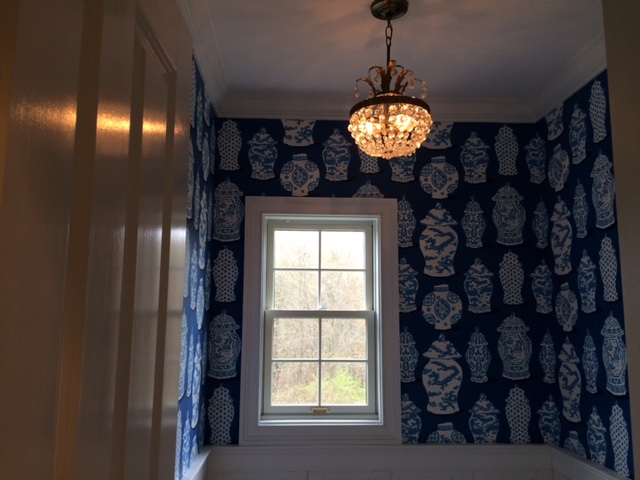
The third collection in the Collective was Fromental, maker of swoonworthy handmade wallpapers and fabrics.  The pictures do not do this collection justice.  Think about silk, which is hand painted and then hand embroidered. After paper backing it, it is applied to the wall.   Some of the embroideries included beads, making a unique 3-D wallcovering that is truly a work of art!

On to the wine pairing!  Adam Japko of Esteem Media led this unique presentation.  Adam writes the blog Wine Zag (click here) He's a super friendly guy whom I've met several times before.  Adam has a open minded approach to wine tasting, with an easy going curiosity.
 Adam Japko discussing a slide.  Fromental wallcovering in the background.  All furniture and accessories by JL Create.

He was sent several pictures of John Lyle's furniture to which he had to assign a wine. So, unlike pairing wine with food, he tried to assign wines that spoke the same language or had a similar quality to a piece of furniture.  His insights were engaging and dynamic. For instance he paired a wine with a specific table because they both "make you think".  (I think he meant they were complex.)  In any case, the whole event "made me think".  So many elements of any art form, be it furniture making, painting, wine making, sculpture, music or food, are similarly described. They conjure emotion.
Elizabeth Ralls, Editor in Chief of Atlanta Homes and Lifestyle magazine was also on hand to show examples from the pages of the magazine for the various styles of furniture.
Here are the wines we tasted:
I wish that I had the slides to show you what was paired with what.  But I wouldn't remember anyway! I was a little preoccupied drinking the wine!
Click on the links to see some truly inspirational people and products.
CL Curated
JL Create
Fromental

Wednesday, May 4, 2016

Cantonese Jars

Look at the Dana Gibson wallpaper from Stroheim in our Connecticut powder
room project --- so thrilled that we forgot to move the ladder! 

 
Would you put this wastepaper basket 
from Dana Gibson in the powder room?  

Tuesday, May 3, 2016

High Point Highlights

Yes, I am really late with this post and you have already forgotten that I even went to the High Point Furniture Market in April and saw lots of cool things.
This year I did a little more shopping for clients than I usually do, but as in years past, I also went to see trends in interior design, see what's new with my favorite vendors and get inspired.
Here are a few of the photos I took:

I think everyone took this picture.  It was a display for a bedding company.  Don't you love the real tree branch hung on the wall with the fake birds perched on top?

More bedding. In crisp red and white.

One more bed in red, white and blue.  The tennis racquets give it a fun touch.

The barn door is such a trend, here it is used as a wall treatment to hide the TV.
When you slide the door in front of the TV, the storage shelves are revealed! Who doesn't need more storage?

In keeping with the rustic wood theme, here is a console from Dovetail that would be perfect for a project we are currently working on.
Detail of the console front.

If you are a fan of Chip and Joanna Gaines and their show, Fixer Upper, (and who isn't?) you will recognize the name Magnolia Home as being the other brand they own.  They have licensed their name to a furniture line, accessories, rugs and now PAINT!

I simply MUST HAVE this antique chandelier.  I've been looking for this style for awhile and don't really want a reproduction.  The amethyst crystals are a bonus.

Another antique chandelier - this one for a client - that features glass grapes.  Stunning!

As you can see, I took very few pictures this time.  I was too busy looking and walking and talking. I will say that we are about to see a lot more color in our interiors.
One of my favorite new finds was Lexington Home Brands.  I had to take a bus to their off-site showroom.  It was a total WOW, so much so that I forgot to take any photos. And as luck would have it, one of my favorite clients works for Lexington and he happened to be standing in the lobby when I arrived. 


Monday, April 6, 2015

100 Windows - #93

Just your basic panels with a 6" border hem, which is the same fabric used in the valance. The valance is either a cornice or a flat valance mounted on a board.  The flat valance would be easier to mount into a bay window.  The draped cording would be interesting to add to the valance, especially since it is in a solid fabric. 
I really like the idea of framing a piece of wallpaper and hanging it like art, as shown here.

Tuesday, May 20, 2014

100 Windows - #37

A brief lesson in using materials in new ways. Here, the cord cleats, usually intended to wrap loose cords or strings, are put to use as brackets to support the curtain. And instead of fabric tabs, or ribbons, rope is used in this casual treatment. 
At first glance the theme of the room appears nautical, but upon closer inspection all the details are used to great effect for the favorite fisherman in your life!
And yes, that is a hanging bed!


Wednesday, March 5, 2014

100 Windows - #21

Do you have a girl in your life that loves pink?
Here's the window for her!
To me it looks like the swag was created by using a square of fabric just gathered up at the corners of the window.  It could just as easily be a scarf. The beaded trim is a great detail.
The hot pink stripe outlining the walls was actually grosgrain ribbon hot glued in place. So cute!

Sunday, March 2, 2014

100 Windows - #18

This shade is very much a hybrid.  Basically it is a relaxed Roman shade with long tails, or what some would call a London blind.  It is also very much like one scoop of a balloon shade. I love that the inside of the pleats area solid contrast color, and that they added a ruffle to the hem.  But you have to see the rest of the room it is in.
You can tell now that it is a model home.  There are so many cute design ideas here.  The curvy alcove created for the bed using plywood, 2 colors of paint and topping it off with some crown moulding is the star of the room. The cutout actually echoes the shape of a very tall headboard. What little girl or even teenager wouldn't love the coziness of it, plus a chandelier?  The ruffly shade really finishes off an oddly placed window and repeats the curves of the headboard/alcove. Along with the functional hook for the backpack, there were fake flowers glued randomly to the walls.  Here's a closer look:


Monday, February 3, 2014

100 Windows - #1

I just realized how many pictures I have of different window treatments, which is to be expected since I an interior designer specializing in window treatments.  Twenty five years in the business means I have covered a LOT of windows and keep hundreds of ideas on file. So I thought I'd share a few.
This is one of my favorite styles, so much so that I used it in my previous master bedroom, only I used gold colored silk and trimmed the swag in crystal beads (and hung an antique chandelier crystal from the double cascade!)
Here, I used a pewter colored silk and lined the double cascade in an off-white silk. The finials were a blown glass encased in a metal birdcage style. (sad note: this finial was discontinued a while ago).
This treatment is actually constructed of three pieces: the rod pocket panel, the open swag, and the double cascade. The second two parts can be stapled or velcroed to the wood rod.

The beauty of this treatment is that it can be used in pairs to create symmetry. Note how it draws your eye up and not only frames the view of the furniture below, but also points toward the artwork between the windows.

Thursday, March 28, 2013

Another DIY

Actually, this is a DI-MY as in Do It Myself.

One of the basement bathrooms in my new house came wallpapered in what I described as faux leather squares. It wasn't offensive or anything and it's masculine style is well suited for it's location next to the bar.

But I had a idea to make it a little more custom.


I bought inexpensive upholstery nailheads in a copper color. Copper seemed appropriate for the color of the wallpaper, and the ceiling outside the bathroom is a copper colored tin.
At the interesections of every 4 squares I pushed in a nailhead. You read that right - I pushed it in. They went in easily with just a little thumb pressure. I only used my hammer on a few near the ceiling.

The effect is really lovely. Subtle, yet interesting.