
Thursday, August 4, 2011
The Greenbrier - A Visual Feast
I have been doing a lot of travelling this year. Whenever I can I love to stay in big historic hotels. Back in February I finally made it to the Greenbrier Hotel in White Sulphur Springs, WV. It is over the top beautiful.
The hotel interiors were originally designed by Dorothy Draper. In 1923, Draper established the first interior design company in the U.S. She invented a style called "Modern Baroque", which is particularly suited to large public spaces and modern architecture.
Draper used vibrant colors in never before seen combinations such as pink and aubergine, with a bit of chartreuse and a touch of turqoise. Her dictum, which I love because of it refusal to enforce any design rules, was "if it looks right, it is right".
When my friend found out I was visiting The Greenbrier she sent me this message: "Gotta love big flowers!" to which I would add: "and big stripes and big chandeliers!" Of course, I love them all.


Fun & Easy Valance

I saw this window treatment in a model home. Such a cute idea! Loved that it was a departure from traditional but wasn't too far out there. Also loved the way three fabrics were used.
But there is a glaring mistake on this treatment. Why did they use white lining on the valance portion?? It really takes away from the effect. My eye went straight to that white lining. It would have been so easy to self-line this or line in an inexpensive cotton in a coordinating color. Maybe it was an oversight - been there! - or maybe they only had so much of the solid fabric - been there, too! - but if that was the case, I repeat: use some inexpensive colored lining! Or add trim along those seesaw edges and you wouldn't see the lining. How cute would some pom poms be along the bottom edge? Or to fancy it up, some tassel fringe?

Tuesday, July 26, 2011
Photo study

This picture comes from my Idea file, which is code for "I stole it off the internet". So I am sorry I cannot give credit to the designer or photographer. (I have a sneaking suspicion it's Carolyne Roehm - must investigate!) It looks like a photo from a magazine or book, though.
If you keep photos of ideas you love, sometimes it is a great exercise to study the photograph. You can more clearly define what you love about the space and you also start to recognize some design concepts.
I'm positive I kept this particular photo because of the brown and cream color scheme. It's so warm and restful. As a designer, one of the constant requests I get when decorating a master bedroom is for it not to be too feminine and this room certainly fills the bill. Sticking to just 2 colors with high contrast is also appealing.
The design concept you see is that of symmetry. Notice all the pairs of things! Symmetry gives you a feeling of balance, that things are on solid ground. You are able to relax when you feel your surroundings are organized. Notice too, the simplicity of the items in the room. If it weren't for the carving on the bed or the frou-frou mirrors, everything would seem rather plain.
Monday, July 25, 2011
Lighting

Why do we live so long with light fixtures (particularly ceiling mounted ones) that are outdated or are incongruent with the rest of the room design? I know I am as guilty as anyone.
Trends in lighting change just like everything else although some classic styles, like a crystal chandelier are always right in the right space.
While at the Atlanta gift show I spied lots of beautiful lighting styles, but I am including 2 new ones here so you won't go into decorating overload.

This lantern style is much bigger than it looks in the picture. If you had a large kitchen island, 2 or 3 of these would look magnificent!

What would you call this style? Lantern? Chandelier? It was very rustic, like pieces from an old oak barrel which is why my first thought was - use this in a wine cellar! It would also be great as a foyer chandelier in a casual home or anywhere you have a sort of lodge look.
Both lighting fixtures by Currey & Co.
Top photo at Valerianne, Vienna, VA
Friday, July 22, 2011
Office Gets New Life
This project is in my own home. When we first moved into our home 17 years ago, the small front room was a TV room, mostly because I didn't want to hear the noise from a TV all the time, especially when I was in the kitchen. We had 3 small children at the time.

When the basement was finished, we moved the TV down there, and it became the teenager hangout. The old room became an office/study. Not MY office mind you, but it did have a pretty desk and an old hutch we used to store books. I have WAYYYYY too many books. I mostly paid bills in there or it was a quiet place to take you laptop.
When I took the before picture, I left everything as messy as it was, because in reality, the room had become a dumping zone. The desk was always covered. Although I still loved the wallpaper, it's heyday had come and gone. Took it all down and painted it a warm neutral color. (If you want to know the exact Benjamin Moore color, leave a comment and I will go look it up.)

The drapes are the real focal point of the room. They are a very rough, natural silk, perhaps matka. I trimmed the hem with a band of a darker, slightly finer silk. At the top, pleated edge, I inserted a small cord covered in a red combed cotton. The hardware is to die for. It is from Paris, TX Hardware.


I moved in two red leather chairs I had. Also moved in a faux mantle I had in a bedroom and placed a flat screen TV on it - you can barely see that. Really, this was what I call a "placeholder" to see if 1. We really sit in there, and 2. If a TV works on that wall. If it all worked out, which it does, I am now on the hunt for a large wall to wall unit to hold the TV and give me more storage. For books.


When the basement was finished, we moved the TV down there, and it became the teenager hangout. The old room became an office/study. Not MY office mind you, but it did have a pretty desk and an old hutch we used to store books. I have WAYYYYY too many books. I mostly paid bills in there or it was a quiet place to take you laptop.
When I took the before picture, I left everything as messy as it was, because in reality, the room had become a dumping zone. The desk was always covered. Although I still loved the wallpaper, it's heyday had come and gone. Took it all down and painted it a warm neutral color. (If you want to know the exact Benjamin Moore color, leave a comment and I will go look it up.)

The drapes are the real focal point of the room. They are a very rough, natural silk, perhaps matka. I trimmed the hem with a band of a darker, slightly finer silk. At the top, pleated edge, I inserted a small cord covered in a red combed cotton. The hardware is to die for. It is from Paris, TX Hardware.


I moved in two red leather chairs I had. Also moved in a faux mantle I had in a bedroom and placed a flat screen TV on it - you can barely see that. Really, this was what I call a "placeholder" to see if 1. We really sit in there, and 2. If a TV works on that wall. If it all worked out, which it does, I am now on the hunt for a large wall to wall unit to hold the TV and give me more storage. For books.


Wednesday, July 20, 2011
The Project Room

Here is a very interesting project I did a few months ago. It is called The Project Room. My client converted an empty bedroom into a space for homework, gift wrapping and other "projects". This was your typical bedroom, with a side window and a back window. She used cabinets on three walls that allowed for desk space and a window seat. In the middle of the room she had a custom made island that was great for storage. She has all of her gift wrap organized in it.

The window treatments consisted of Stagecoach Valances, which look a bit like stationary Roman shades. Under the valances, she put honeycomb pleated shades with the top/down-bottom/up option.
You can see that we had a custom cushion made for the window seat and dressed it up with some pillows in coordinating fabrics. All fabrics by Duralee.

What empty space in you home could you make more useful?


Tuesday, July 19, 2011
Atlanta Gift Show
I have never been to the Atlanta Gift Show before. Here are some superlatives: Gigantic, Crazy, Overwhelming, Colorful, Inspiring.
I should have taken more pictures, particularly from the escalator in Building 3 to give you a rough idea, but here are a few things(a very few things) that caught my eye.
Gotta love big flowers.
A floor that I assume is removeable and looked like an interesting do it yourself project. I saw several variations of this, and had seen it before at High Point Market, but I still find it fascinating and beautifully rustic and elegant at the same time. I think this was at Barreveld.
Also at Barreveld, this vignette with the tall iron stags balancing on iron balls. Had to have them so I bought them. Everyone who has seen this picture wants to know what I am going to do with them. Patience, dear friend, patience. (Perhaps I should say, Deer Friend - hee hee.)

Colorful rug at Surya. Might use it in a project.

This was a wonderful bar/buffet with slide out trays and room for wine bottles. I'm not positive, but I think it was at Guild Master.

Last but not least, a little cottage chic. This was a great piece for storage and came in lots of colors. I'm thinking about using it in a child's room.
I should have taken more pictures, particularly from the escalator in Building 3 to give you a rough idea, but here are a few things(a very few things) that caught my eye.

Gotta love big flowers.

A floor that I assume is removeable and looked like an interesting do it yourself project. I saw several variations of this, and had seen it before at High Point Market, but I still find it fascinating and beautifully rustic and elegant at the same time. I think this was at Barreveld.

Also at Barreveld, this vignette with the tall iron stags balancing on iron balls. Had to have them so I bought them. Everyone who has seen this picture wants to know what I am going to do with them. Patience, dear friend, patience. (Perhaps I should say, Deer Friend - hee hee.)
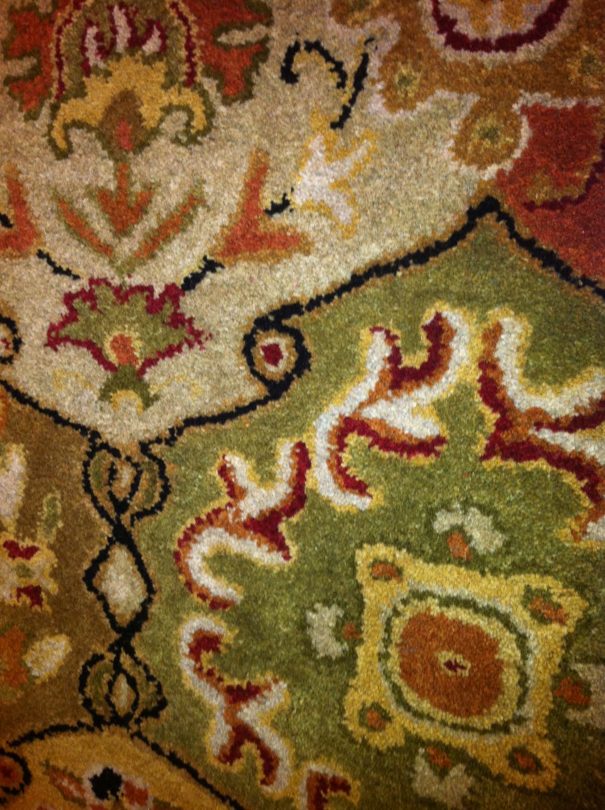
Colorful rug at Surya. Might use it in a project.

This was a wonderful bar/buffet with slide out trays and room for wine bottles. I'm not positive, but I think it was at Guild Master.

Last but not least, a little cottage chic. This was a great piece for storage and came in lots of colors. I'm thinking about using it in a child's room.
Subscribe to:
Posts (Atom)