Monday, December 14, 2015

Love Affair with a Chair

A friend once joked that I should open a Chair Store. It seems that when I am looking at fabrics, sooner or later I am going to say, "That would make a great chair!"  I do have a love affair with chairs.  The more the merrier! And what an opportunity to introduce a beautiful color or pattern to a room.
Recovering a chair is also a great way to update a space. Or in the case of a dining or desk chair, if the fabric is pricey you really don't need much.
For this kitchen we had fun with the desk chair.  First we had the chair painted white and distressed a little to match the cabinets which were also getting painted.
Then we added a little PINK ZEBRA! Does it get any better than pink zebra?  I don't think so!
The walls had been painted a soft blue grey.  The pink and blue echoed the colors we had used in the adjoining living and dining room. More on that later!
It's hard to believe that two months ago this kitchen had dark cherry cabinets and Tuscan brick-red walls!

Chair seat fabric by Duralee.

Thursday, December 3, 2015

Pantone 2016 Color of the Year

This just in from Kravet:
I'm so used to having those little squares filled with color that at first I thought both of the "new" colors were very similar.  But now I'm thinking that Rose Quartz must be the pink color.  I don't have a Pantone color deck to verify this.
At the recent High Point home furnishings show I did see so much blue - this shade and much darker. There were many pinks, also, including a blush color like the pillow in the bottom center of the photo.
Are you thinking what I'm thinking?  That this combination looks a LOT like the 80's??
These colors look a little fresher than the ones I am remembering - let's see how it plays out.
I will say that many of my clients are asking for blues - and I just finished a pink living room - so perhaps I work with all the cool kids who are ahead of the curve, trendwise!

Monday, November 30, 2015

Rub-a-dub-dub!

Nothing like a cheerful red valance to make you want to do a little laundry.
Flat valance with pleats at corners.
The most adorable powder puff tape trim!
Micro-check fabric from Duralee.  Trim from D'Kei.
Fabricated by SK Fabric Interiors.
Photo by Bob Narod.

Monday, November 9, 2015

Color Forecast and Inspiration

Attended a beautiful event last week at the Washington Design Center, presented by Sherwin-Williams and their color forecast for 2016.
The presentation, given by the Director of Color Marketing,  Jackie Jordan, showed the four emerging palettes for next year, and spoke not just of the colors but the emotions and social drivers behind those palettes.
Fashion models were made up (and painted!) to represent the various color trends.

 
PURA VIDA
Natural materials - honed and sheer.
Sand, marble, grey, khaki & blush
 
 
MAS AMOR POR FAVOR
Social - gatherings & network
Flower power - greens and pinks
 
 
NOUVEAU NARRATIVE
Maker Movement - Rugged determination
Olive, denim & brass
 
 
TRAJECTORY
Technology & the Future
Icy blue, pewter, plum and gloss
 
 
Following the presentation we were invited to the various showrooms where displays visually described fascinating interpretations of the four trends. Even the refreshments were on trend! And there was bubbly galore!
A step outside the elevator had us stopped in our tracks at the entrance to the J Lambeth showroom and their collection of Mas Amor Por Favor products.
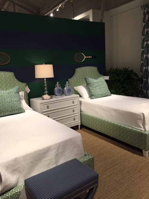

 
The Century showroom had multiple displays, all towards the theme of Pura Vida.
 
This is chocolate candy made to look like silver rocks!
 
This continued the trend we saw at High Point of rocks, minerals and gemstones.
 
Couldn't resist showing you this fantastic mirror from Century!
 
Although we toured many other showrooms, we ended our day at Osborne & Little, where the affable Nick gave us a personal showing of their fabric collections and we dined at their very pink buffet!
 
MAS AMOR POR FAVOR!!
 
First 4 pictures from Sherwin Williams 


Tuesday, November 3, 2015

A little inspiration

Sometimes it comes to us in the quietest places.  Inspiration for a color scheme, for a garden design, for a poem.
I stumbled upon this sight on a walk in town a few days ago.

Those green spheres on the ground that fell from a tree - what are they? Up close they look like little green brains! Last year I collected a bagful and piled them in a bowl on my side porch.

Friday, October 30, 2015

Pillow Invasion!

Returned from High Point last week and still getting my photos organized. 
One thing is certain - one of the quickest and easiest ways to update a room is with new pillows! Everywhere I looked there were options - and not just from the usual vendors who have always included pillows. Here are a few to inspire you:
This collection is from Emdee.  Note the trend to pile a lot of pillows onto a sofa or loveseat.  It gives you that chance to add more color or texture. Love this velvet settee, by the way.

Global Views had not one, but two of these round ottomans - what do you call them? Conversation ottomans?  Roundabouts?  In any case I have been wanting one for several years. I love how this furniture piece can be upholstered in a neutral and then splash color all over it with pillows.

While the pillows on this sofa from Bliss Studio don't add any extra color, they are beautiful and add a touch of decadence.

More decadence!
Here is another photo of pillows that don't add any extra color but look so luxurious and inviting. These from Reborn Relics.

These pillows at Vanguard that matched the headboards were playful and fun.

Talk about high contrast! This youthful, feminine vignette shows part of the new Kate Spade collection from EJ Victor. I was lucky enough to hear the design director for Kate Spade Home at breakfast that morning and learn of the inspiration for this collection.

And while we are on the topic of Kate Spade, I travelled over to Jaipur to see the rugs they were offering as part of the new Kate Spade Home collection. While I was there I posed with my favorite cocktail from High Point in front of a collection of some colorful pillows they offer. Yummy!

Thursday, October 15, 2015

Monday, October 12, 2015

2016 Color of the Year

For the first time, I saw this color coming.  But I am still a little shocked that Benjamin Moore would choose this as the color of the year:
We've certainly seen it in fashion - the white dress has been everywhere the past few months and I imagine it will continue into winter, now that we are breaking the rules on that sort of thing.
I love an all-white room, but it is not always practical. When using a lot of white in a room, it's important to use various textures.
White and any other color is an easy, impactful way to choose the color scheme.
Other companies should be coming out with their own colors of the year.  I can't wait to see what they are!


Monday, October 5, 2015

Who Loves Pink?

Was so excited when this Instagram photo from Tony Baratta crossed my screen:
I am currently working on a project that we are calling A Study in Pink. It too is a living room and we are taking our palette of pinks and blues into the dining room, study and now kitchen! We are also adding a mix of silver and golds with splashes of those metallics on the mouldings and some furniture. I cannot wait to show you the finished design!
Here are some of the fabrics:
You can see, we are also mixing a lot of patterns.  This is going to be so bold!

Friday, October 2, 2015

Field Trip Friday

Well it's too wet outside for Field Trip Friday so we will pretend my trip this past Wednesday to the Washington Design Center happened today.
Check out this gorgeous chair I saw in the Holly Hunt showroom, upholstered in antique Fortuny fabric.  I knew something was up when I saw that the fabric had been seamed on the top of the chair near the back.  Home decorating fabrics made today are almost always 54" wide, making it unnecessary to have a seam on a chair like this. This seam became part of the charm.While we are on the subject of chairs (for the second time this week!) there is a special auction going on at the Robert Allen showroom.
The three chairs you see here are the same style and size, but different designers covered them in different Robert Allen fabrics.  Can you believe the difference? Ah the power of fabric and pattern!
Chair on the left by Lauren Liess,  center by Skip Sroka and right by Mary Douglas Drysdale.

Wednesday, September 30, 2015

Window Wednesday

Sometimes we like to say, "A door is a door", meaning that we don't treat it like a window.  But this door, which we had recently outfitted with a new 2" wood blind, looked a little lonely in a beautifully designed kitchen with it's lovely window treatments we did about a year ago. We used the same fabric and trim that we used in the rest of the room.
And now, everyone is happy! (Even the valance is smiling!)

Monday, September 28, 2015

Friday, September 25, 2015

Crochet (??!) Chairs

I saw this recently at design-confidential.com.
Pictures of crocheted chairs or "swivel thrones" by Olek as presented by Todd Merrill Studio.
Proving again that it's ALL art!
How do you create YOUR work of art?

Wednesday, September 23, 2015

Pillows

Finished a fun project and need to add a little color to a neutral sofa that we had just reupholstered.
First, the gold pillows were added but it wasn't quite enough, so we added the center pillow which looks like a mix of two fabrics, but is really the same fabric turned over to the reverse side.
The red side is the "face" of the fabric and is what we used for the draperies in this room.  This silk fabric is so cool because depending where you place the pattern it can look completely different.

And while we are on the subject of pillows, look how adding just one pillow to the center of the bed makes it look more complete.
 
Sofa and pillows - both fabrics by Duralee
Bed - pillow shams and bedspread - fabric by Vervain
Bed - Square pillow - fabric by Highland Court

Monday, September 21, 2015

Weekend High Notes

It was a beautiful weekend here, filled with morning and evening walks in town, a high school reunion, and cozy gatherings inside
and out
as we bid a fond farewell to summer........

Wednesday, September 16, 2015

Silk and Sheers

Rarely would I (or anyone, for that matter) show you a window treatment that a client disliked.
But the truth is, I liked it and thought it turned out beautifully.  Rich, full silk side panels over a polka dot sheer looked soft and feminine.  The client thought it "too polka dotty", but she had chosen this sheer specifically. We had used the existing rod.  The client hadn't touched up the paint from where the old valance had been removed.
Which brings me to this point:  be sure to paint, or touch up paint, at least a week before your new window treatments are installed.  It is so much more difficult to do afterwards.

Tuesday, September 15, 2015

Wednesday, September 9, 2015

Window Wednesday

It may be Wednesday, but there were no windows involved in this particular Wednesday.  It did involve putting on a new bedskirt with a client, and with much huffing and puffing and pulling and weightlifting a giant mattress, and falling apart with laughter as said client did a face plant into the mattress when I pulled at just the wrong moment, we got the bedskirt safely on the bed. More about that later.
I thought I'd share with you the most repinned window treatment on my Pinterest "Window" board this week.  I can never predict which it is going to be.
I have not done many swags lately, but these pointed swags really interested me and apparently, interested a lot of other people as well.  Although I love color, I really liked the softness of this neutral room and I adore the woodwork.
The two other most pinned pictures were also from the Mrs. Howard website. They were both brightly colored, large scale printed Roman shades, a trend that seems to be on the rise.
Check out MrsHoward.com.  It is a great site!
And to see thousands of wonderful window treatments, follow me on Pinterest
Pinterest.com/ToniKorby

Tuesday, September 8, 2015

A Spectacular Monday

Just when I think I can't get any luckier, I do.
In spite of really good intentions to get a little work done on Labor Day, we decided to take advantage of the most beautiful of days and head to a place we'd never been. How we have missed The Barns at Hamilton Station Vineyards, I'll never know.  It was 7 minutes from our town of Leesburg, Virginia -- 7 MINUTES!!!
There are many many wineries in our general vicinity and some have a beautiful setting, while others make some pretty good wine.  This place had BOTH!

It was absolutely necessary that we sit outside. There was an excellent musician, Todd Brooks, playing. The view looking the other way was just as lovely.

The inside tasting room was perfect if you like a rustic old barn - and I do.  Wouldn't this be a divine place for a wedding reception? I can imagine at night with a fire in that fireplace and those twinkling lights, that there is no place cozier to share a glass or two.

Near the end of his set, Todd Brooks sang "Can't You See" by Marshall Tucker, one of my Top Ten. That's it! I was done!
 
For more information and to see more pictures of The Barns at Hamilton Station Vineyards, click here
 

Sunday, September 6, 2015

Curves

Nothing quite as anxiety producing as a window on a curved wall that needs to be dressed. Most people don't know that you can have a rod bent to match the wall. The results are spectacular!
The same can be done with a bay window. Not only rods that have rings, but also your basic traverse rod can be bent, and the draperies can be opened and closed!
An easy way to create such a rod on your own is to use a bendable "elbow" that attaches between two rods. That's what we did in this guest room.
I know you'd love to see those gigantic finials close up so here's a better look:
These gorgeous finials in a rose gold finish looked handmade and weighed a ton!

First two photos from Brimar.
Rose Gold finials and rods are from The Finial Company.