Last week I was honored to participate again in the Open House at Kleppinger Design Group in Merrifield, VA. Enjoy this montage of work by other Northern Virginia designers.

Wednesday, December 7, 2011


Monday, November 14, 2011
The Harvest Touch

Here's a quick little low-cost update I gave to my foyer. On the foyer wall is a wreath of cherubs, made to look like it is carved of wood. I wanted to add a bit of something to reflect the season and came up with using a little berry wreath in Autumn colors inside the larger wreath. I had just hemmed a burlap table skirt and instead of throwing away the piece I cut off, I made a ribbon of it. Then I used the burlap ribbon to hang the small wreath from the larger one. So simple, so pretty.

Wednesday, November 2, 2011
Movin' & Shakin' Things Up

Oh, how I wish I had taken a before picture!
One of my favorite clients is on her 3rd house, or rather her third house with me! Now with her boys all grown, she and her husband have moved to a lakeside golf community and loving it.
The house was a resale. She liked the layout and even kept some of the paint colors. The house also came with a lot of window treatments that were very nice, but not in her taste. So yesterday we installed new draperies in the living room. What a difference. First of all, the original drapes were a very dark, red faux silk.
 My client chose a fabric printed with a stylized suzani design, very bold and cheerful. So cheerful, in fact, that when her husband came in and saw the gorgeous treatments at the windows he said, "Wow! That looks SO much better. It looked like a funeral parlor in here before."
Notice the serendipity of the printed pillow on the sofa.
 I call it the Little Sister print of the drapes. The funny thing is, that pillow matched the drapes in the living room of house #2! The homeowner likes a particular color palette and sticks to her guns! That is one way to keep continuity in your home, whether you move or not.
We kept the hardware from before. The shutters were installed right after my client moved in. The fabric is from Kravet and the trim from Stout Textiles.
Monday, October 31, 2011
Happy Halloween!

My favorite Halloween picture.
I'd go out and buy a bushel of pumpkins if I owned that staircase!
Thursday, October 20, 2011
In Living (Room) Color


Get ready. Things are about to get a little more colorful. After a few years of no-color or mostly gray rooms, we are seeing a trend of lots more color.
This living room is a good example of bringing color into what started as a very neutral room. It is actually a good idea to keep you larger pieces of furniture and maybe your window treatments neutral so you can add color - and change it up - with smaller less expensive things.
The wall color in this room was a peachy beige - nice and warm but not so much personality that it is overpowering. The sofa is a classic style in a neutral gold. We added some pizazz with the red velvet pillows that are the same velvet as the gorgeous chairs.
The dining room chairs were upholstered in a muted geometric print.

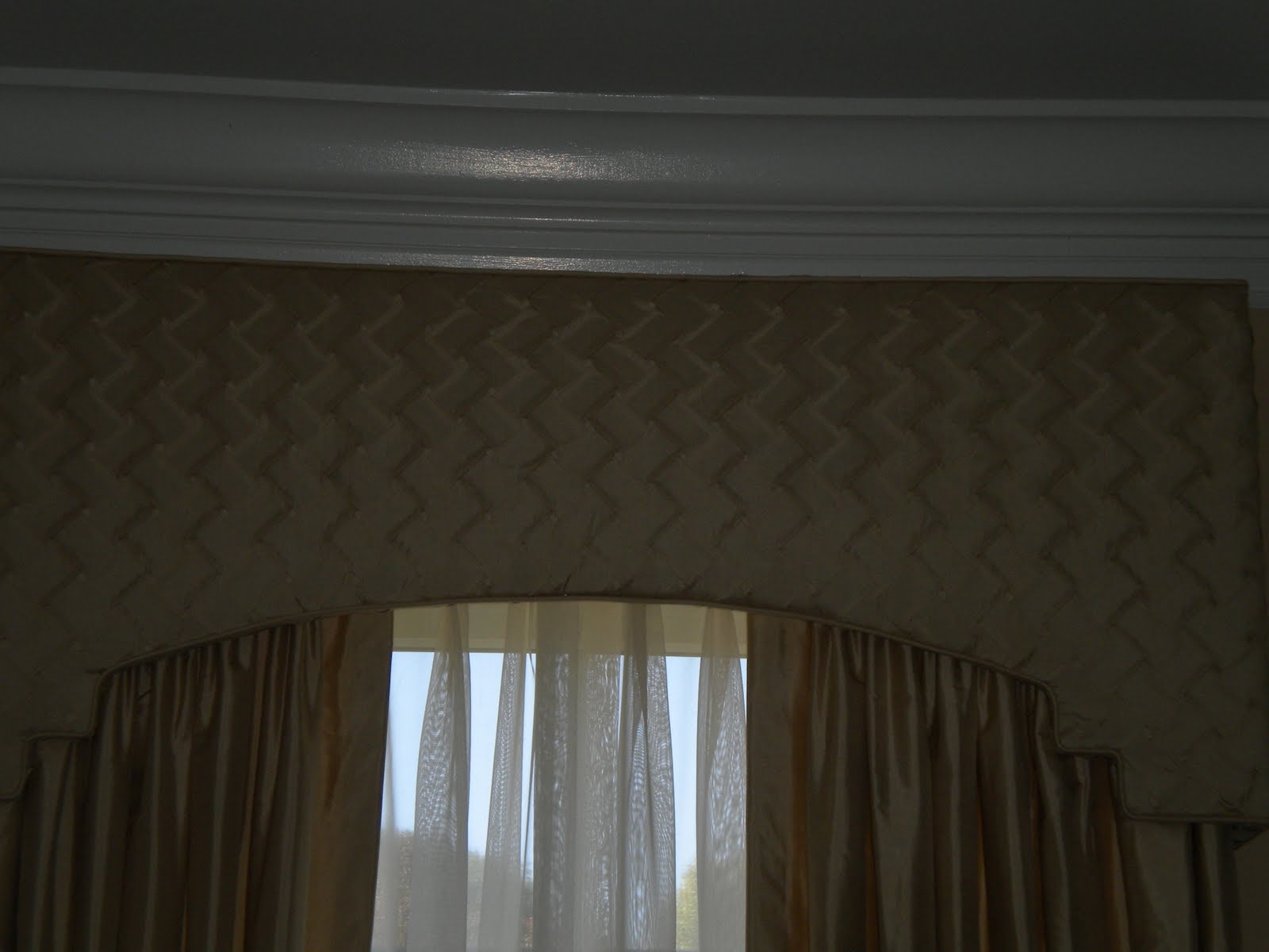
Since the dining room and living room are across the foyer from each other, it was better if the window treatments were all the same. We kept those in a subtle tone since there were so many windows in the two rooms. But we added some texture by having the same silk of the draperies pleated into a basketweave pattern for the cornices.
My client has a lot of beautiful, colorful objects on her display shelf. And she plans to add a colorful rug when she finds the perfect one.
One other way to make a room interesting besides adding a lot of color is to vary the textures and shapes. For texture we had the pleated vs. plain silk, the red velvet, the matelasse and nailheads on the sofa, and the shiny brass lamps. The glossy marble foyer was also added midway through the project. But the most texture of all was in the wonderful print over the sofa.
 Look at the variety of shapes we used: most noticeable are the backs of the red chairs, the arms of the sofa and the bottom of the cornices which not only echo the shape of some arch doorways in the home, but the stairstep detail is a reference to the Asian display case.
Sofa and red chairs by Duralee Fine Furniture. Fabrics on sofa and chairs by Duralee. Dining room chair fabric by Chelsea Frank. Drapery fabrics by Libas Ltd. Pillow trim by Kasmir.
Tuesday, September 27, 2011
One More Reason to Go Shopping

Decorate your home. It gives the illusion that your life is more interesting than it really is.
-Charles M. Schultz

Photo from last year's Homearama. Designer unknown.
Thursday, September 22, 2011
Find Your Center

No, this isn't a post about finding your spiritual center. A recent question on Facebook was about centering artwork on a wall in relation to furniture. Although I chimed in, I agreed with everyone else who chimed in that you should center large artwork over the furniture - in this case a sofa - and not on the large wall in general.

I happened to run into this on a project we recently completed in Virginia. The large lovely painting was centered on the wall when I got there. It had been hung in relation to the old sofa and draperies. We had installed a smaller sofa and new window treatments, but waited to move the picture until the end. With two large brass floor lamps from Restoration Hardware providing the symmetry, we moved everything down, or to the right a little. We could have moved it all further, but when we did, a very unsightly outlet showed to the left of the sofa. Upon entering the room that's all my eyes saw! Ugh! So rather than strictly following the exact measurements, we fudged it a little and it looks so much better. Sometimes it is better to make your rules up as you go.

I will post more pictures of this project later. There are some beautiful silk window treatments and red velvet chairs that you have got to see. We are also about to change the rug, the coffee table and add a settee.
Subscribe to:
Posts (Atom)