Saturday, February 9, 2019

Color is the Question

Last week I wrote a post about the overuse of the color gray.  If gray is not the answer, then I suppose color is the question.  The most common question I get regarding color is what color to paint the walls. The answer to that question is so dependent on the room you are considering and what is going on in the rest of the house.  Today I'd like to give you ideas of ways to add color if you already have a neutral backdrop.  Remember, the wall color is NOT the color scheme.  It can be part of a color scheme or it can be a compliment to the rest of the colors in the room. Here are a handful of ideas:
Colorful fabric is an obvious choice, even muted color.  

More colorful fabric, vibrant this time.  And colorful trim.

You may remember this colorful wallcovering from Dana Gibson with her matching trim on a white Roman shade.

Fresh flowers brighten any spot.

Colorful walls, tablecloth, artwork and draperies.  Notice how the adjacent wall space on the far left is another shade of blue!

This master bedrrom in shades of green and violet is still restful and inviting.

This trim from Brimar is able to withstand the elements, so your outdoor areas can be colorful, too!

The MOST colorful drapery hardware from Duralee.

Gorgeous fabrics and wallcoverings from Kim Parker.

Floral fabrics are everywhere! This one from Kravet Couture.

My all-time favorite fabric from Osborne and Little.

Pillows from Jaipur.

Pillow from Surya, when you want SOME color, but maybe not LOTS of color.

Colorful furniture, rugs and pillows in the EJ Victor showroom at High Point.


Sunday, February 3, 2019

Gray is not the Answer

I'm going to make a politically charged statement:

You don't have to paint your walls gray!

I know, I know.  It's everywhere.  JoJo paints a lot of her walls gray on her show, as does Christina.  It's everywhere, and gray's demise has been predicted for months.  And yet.......it's still here.

My friend recently listed her house for sale and a stager was brought in who told her to not only paint her walls gray but her beautiful cherry kitchen cabinets as well.  She refused.  Seriously, do people think that gray is the only neutral color?

I get it.  The realtors are trying to present the most neutral home possible, but is it really true that people can't visualize their way past a paint color?

And don't get me wrong; I love gray.  When I was 10 years old it was my favorite color.  I have gray in two of my guest rooms.  One is gray and yellow (mostly yellow), and one is gray and pink.
Duvet cover by Callisto Home
All gray bedding from County Road. Pink pillows with glass bead trim designed by Antonia Korby Design.

And that's my point.  In a world where you can have any color you want, gray is not the answer.  I have decorated more gray on gray rooms than you would believe, but that is because it came at the request of the homeowner. "How about if we add a little yellow in the draperies, because there is some yellow in the painting in this family room?"  "No", was the answer, "I think I'd like some some white draperies with gray embroidery on them." The dining room was already gray and white, as were the living room and kitchen.  That kind of decorating is highly photograph-able, and also has a model home quality, but can get a little boring.  And drab. And lacking much personaltiy, or CHARACTER, as they say on TV.
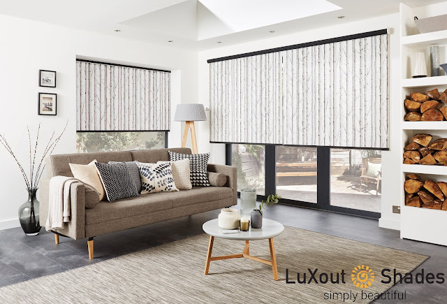
Roller shades by LuXout

And I get it that gray goes with everything.  Everything. Every color looks good with the right gray.  So please, feel free to use a LOT of color.  Because that is the trend that I'm seeing now. 
I know that I have shown a lot of gray/yellow combinations but I also love gray with red and gray with bright green.

I agree that a technicolor house would be a difficult house to sell.  But if you are going for neutral, there are so many other "colors" to choose from.

In  the end, my friend sold her home for more than her asking price. The buyers said that when they walked through the house for the first time, it just "felt like home"!

Saturday, November 17, 2018

Flutter By

Have you noticed the new trend in decor?  It's the butterfly, she's everywhere!  As a strong motif or part of a more varied print, for the most part, the butterfly reads as a floral and therefore could be used in any room in your home.
Here are just a few of the fabrics and wallcoverings we have come across:
Benson, Natural from RM Coco
The embroidery on this is gorgeous.  The background is a linen look fabric.

Flight of Fancy, Lapis from RM Coco
Another embroidery and some of the butterflies are metallic. Cotton sateen ground fabric.

Flight of Fancy, Charcoal from RM Coco

A Lulu DK fabric from Duralee. This is a print, not an embroidery, but it also has some metallic accents

Another colorway of the Lulu DK fabric from Duralee.

Butterfly Garden from Osborne & Little. This photo is from their website.

Deya wall panel from Matthew Williamson. Available through Osborne & Little.  Talk about transforming a wall!

Fabric from Studio G, available through Clarke and Clarke

Formentera sheer fabric from the Deya collection by Matthew Williamson.
We have this fabric in the studio in 2 colorways.  It is so soft and sheer.  The butterflies will surely look like they are fluttering when the wind blows.
Photo from the Osborne & Little website.

Monday, October 29, 2018

Raise the Bar!

When I bought my current home six years ago, there were already features present that I couldn't change. Like this:

I mean the wood work is beautiful and all but the
 open arch portion mystified me until I happened upon those brown urns in a store in Connecticut.  For 90% off.  I'm kind of lucky like that. The bronze statue is one my son inherited, but he doesn't have room for yet.  Darn.
The cabinet below the arch was actually made to hold a TV, back when TV's were really deep.

That's a pretty cavernous hole!

And not attractive either!
As you can see, it not only had a pull out ledge for the TV, but also a shelf built into the top for the cable box or a DVD player - the house was built in 2003, after all. But you may have already noticed that this shelf is right next to the window in the corner of the room.  It is a terrible location for a TV!
Hmmmmm.  What to do........

First I added a little hanging chandelier to the back.
This light fixture came from my old house and used to hang behind my bed.
But it was kind of glaring when the lights were on.

So I added these little shades that I had for my chandelier at Christmas. Don't worry, it gets better looking.

Then I added the only thing that I purchased for this project.


These hanging wine glass racks from the Container Store fit perfectly on the DVD shelf.
By now you have guessed that I turned this eyesore into a BAR!!
I added a few wine glasses, some beverages and some accessories and VOILA!

That's an old desk mat that was in the cabinet underneath this one for some reason.  I thought it would be good to put the bottles on.  The tiny flowers were both gifts and I will always try to fit a flower in wherever I can! I used the bigger liquor bottles to hide the electrical outlets.
It's pretty cute with my pumpkin for Autumn.

And of course, he lights up!

And here is the view when you are sitting across the room. Ahhh, much better than a TV!
And Clarence the doggie really appreciates it.


Wednesday, August 22, 2018

Not Your Mother's Roller Shades

Growing up, my mom made all the window treatments in our home.  Well, I would bet my grandmother made the pinch pleated draperies, but my mother made everything else. 
When she learned how to make a roller shade, you better believe suddenly every window in our house had one!
For years, the roller shade with the scalloped hem was everywhere and they were usually made of cheap fabric, or worse, plastic!!  And they were always white.  Then the style fell out of favor and was replaced by mini blinds, then honeycomb pleated shades, wood blinds and plantation shutters.
We are about to install this pattern in a bedroom.  Stay tuned!

We recently found the next generation of roller blinds from LuXout Shades.  The fabrics are sourced from all over the world. There are solids to go with every decor and prints that can become the focal point of a room. And these shades are Made in America, in Virginia, in fact.
Take a walk in the woods without leaving the comfort of home.

Unlike the shades my mother made, the roller at the top can be hidden with a headbox.  The hems can be plain or scalloped and bedazzled with an assortment of trims.  

Our customers are loving this product. Depending on the style and options, the roller shade can fit any decor from traditional to eclectic to contemporary.
Imagine this in a beach house.  Or in the beach house you are dreaming about.

Monday, August 13, 2018

Blackout Bedroom

Occasionally, when working with a client on one project, we will spot a fabric for another project.
This gorgeous grey fabric with a geometric stripe woven in caught our eye and knew it would be perfect for the master bedroom. The husband wanted "blackout curtains" so he could sleep late and not be bothered by the sun peeping in.
But there were so many windows in this bedroom plus sitting room and the lovely fabric was a bit expensive for long drapery panels everywhere.
We hit on this idea of traversing drapes on the back windows and Roman shades on the side windows and in the sitting room. (Actually, it was the mother-in-law who thought of this!)
The custom made pillows in shades of grey, cream and gold were the finishing touch!

I love the mix of masculine and feminine. But mostly I love the fact that the husband thinks he's going to sleep in!  These clients have a newborn baby!! 

Drapery fabric by Unique Fine Fabrics.
Large grey pillow fabric by RM Coco.
Trim by Trend
Geometric pillow fabric by Fabricut
Velvet floral pillow fabric by Trend

Monday, July 16, 2018

One fabric, Two rooms

If you want to unify two spaces, especially if they are side by side, try using one fabric for both, like we did here: 
fabric by Kasmir

Here is the Dining Room, before:

And after:

And a different view: 


And here is the Living Room before:

And after:

Another view:


And finally, a close up of one of the drapery panels and the hardware: